Why is promotional item design crucial for brand impact?
- grafik574
- Feb 10
- 4 min read
How do colors spark emotions and associations in promotional item design?
Colors activate our subconscious and trigger measurable physical reactions—they make us more alert, relaxed, or motivated, and they shape how your brand is perceived. In the following blog post, you'll learn everything you need to know about colors and shapes in promotional item design.

Red stands for energy, passion, and urgency, and radiates strength, activity, and warmth. Red is also particularly well suited for accents that are meant to catch the eye.

Yellow stands for sunshine, optimism, and curiosity, radiating good cheer, lightness, and agility. It quickly attracts attention and makes products more vibrant.

Orange stands for vitality, enthusiasm, and joy of life, and radiates dynamism, openness, and closeness. It has an activating and appealing effect—products are perceived as more spontaneous and accessible.
Did you know?
The color orange causes the release of dopamine, the reward hormone, in the brain.

Blue stands for trust, calmness, and consistency, and radiates seriousness and clarity. It supports the impression of reliability—ideal for emphasizing trust and dependability.

Green stands for nature, growth, and balance, and radiates freshness, serenity, and harmony. It is suitable for use wherever you want to create a good feeling in everyday life.

Brown, Black, White and Grey together represent the world muted colors: they form the framework in which colorful accents take effect, thereby controlling the overall mood and value.
Brown and black appear powerful and high-quality. White stands for clarity, cleanliness, and calm. Gray appears modern and professional.
How do shapes, geometry, and symmetry influence the perceived quality of promotional items?
In addition to color and basic shape, the arrangement of design elements also influences the perceived value of a promotional item—especially symmetry.
Symmetrical designs are processed more quickly by the human brain and perceived as more harmonious, stable, and high-quality. This is precisely why they are considered a strong signal of quality in design psychology.
Empirical studies show that symmetrically designed packaging is significantly more often associated with premium character and higher product quality than asymmetrical variants.
In a large-scale online study, participants consistently opted for symmetrical layouts across multiple product categories when asked to rate a product as “high-quality” or “premium.”
For promotional items, this means that clear axes, balanced proportions, and a calm, orderly design convey seriousness and professionalism—a decisive factor in the B2B environment.
The design language of individual elements also influences perception.

Round Shapes
stand for harmony, closeness, and emotionality. They appear soft, appealing, and inviting—ideal for ergonomic ballpoint pens, drinking cups, or giveaways that are highly relevant to everyday life.

Square and rectangular Shapes
convey stability, order, and reliability. They appear structured and competent—particularly suitable for notepads, calendars, or packaging in the B2B environment.

Pointed, triangular shapes
They symbolize dynamism, direction, and performance. They are suitable for technology- or sports-oriented brands, but can also be perceived as aggressive if overemphasized.
For promotional item design, this means that rather than being “eye-catching at any cost,” a clear, balanced, and deliberately minimalist design often appears to be of the highest quality.
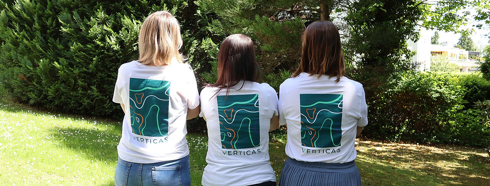
How does Verticas develop customized promotional items with the right design for your brand?
"As the design team at Verticas, we ensure that the colors, shapes, and proportions of a promotional item reflect your brand identity in the best possible way. To do this, we analyze key brand parameters and use them to derive a suitable design direction.
The design language of your logo plays a decisive role here: is it more angular or rounded, compact or dynamic?
On this basis, we select product shapes that support the logo's effect and do not compete with it. At the same time, we make sure that the design fits the brand character—a robust craftsman's brand needs different product shapes than a modern IT company.
The result is promotional items that combine corporate design, logo, and brand personality into a coherent, high-quality overall image."
Johanna Schilly, Teamlead design

FAQ - Farben, Formen & Werbeartikel
How do I choose the perfect combination of color and shape?
Start with your brand identity: define the values you want your products to communicate and choose colors and shapes that visually support these values.
Our in-house graphic design team and sales team are here to help you create customized products that are tailored precisely to your requirements and corporate design.
2. Which form looks most professional?
Symmetrical and clear shapes convey seriousness and premium quality. Round shapes appear friendly and approachable, angular shapes appear stable and structured, and pointed shapes appear dynamic and performance-oriented.
3. Can colors and shapes influence purchasing decisions?
Yes—both color and shape subconsciously evoke emotions and trust. Studies show that symmetrical designs and harmonious color combinations significantly increase perceived quality and value.
4. Which color is suitable for my promotional item?
The right color depends on your brand identity: blue signals trust, green signals sustainability, red signals energy. Combine colors strategically with the desired brand effect. Our Productfinder helps you find the right item.
Quellen
Gesundheitskasse, A.-. D. (2021, 17. Juni). 13 Farben: Ihre psychologische Wirkung. AOK - die Gesundheitskasse. https://www.aok.de/pk/magazin/wohlbefinden/entspannung/13-farben-ihre-psychologische-wirkung/
Kegel, M. (2022, 5. Dezember). Farben und ihre Bedeutung im Marketing. Vispronet® Blog. https://www.vispronet.de/blog/farbpsychologie-marketing/
Romeo-Arroyo, E., Jensen, H., Hunneman, A. & Velasco, C. (2022). Assessing the influence of packaging design symmetry, curvature, and mark on the perception of brand premiumness. International Journal Of Gastronomy And Food Science, 31, 100656. https://doi.org/10.1016/j.ijgfs.2022.100656
Shi, A., Huo, F. & Hou, G. (2021). Effects of Design Aesthetics on the Perceived Value of a Product. Frontiers in Psychology, 12, 670800. https://doi.org/10.3389/fpsyg.2021.670800


Comments