WE PRESENT OUR NEW CORPORATE DESIGN: CLEAR. CREATIVE. FUTURE-ORIENTED.
- grafik574
- May 15, 2025
- 1 min read
We proudly present our revised corporate design – a groundbreaking milestone in Verticas' visual brand identity. The new design combines clarity, innovation, and individuality into a modern appearance that communicates our values and services even more precisely.

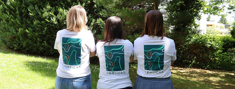
Uniform and flexible – the new look
The focus is on our further developed logo, which is used in clearly defined variants for our business divisions. It remains the defining identifying feature and is complemented by a minimalist icon that sets new standards, especially in digital applications.

Color meets function
The new color concept combines primary, accent, and neutral colors that specifically convey corporate values such as stability, creativity, sustainability, and precision. A fresh color gradient between Deep Teal and Green Flow symbolizes our core competency: the close connection between product and process.
Typography with character
Using the modern font Montserrat and the emotional accent font Verveine, we design our content to be concise, reader-friendly, and with a touch of personality – for all channels and media.
Design with a system – elements that work
Whether it's attention-grabbing distractions, interactive buttons, or the distinctive V-shaped design element: our design system is well-thought-out, user-friendly, and ensures a consistent brand presence. The new Topolines also build a bridge to our roots in Wiesbaden – subtly and effectively.
Our promise remains: THIS IS THE FUTURE.
With the claim “THIS IS HOW THE FUTURE WORKS” we make it clear what Verticas stands for – innovative product solutions, holistic service and a design approach that combines functionality with aesthetics.

Discover our new design in action – across all our channels and products.
Questions? Write to us: info@verticas.de


Comments